Transform the Storm
With the San Francisco Public Utilities Commission
Objective
The San Francisco Public Utilities Commission (SFPUC) is more than just a utility, working to improve quality of life in a changing environment for all San Franciscans. After partnering to complete another brand project together, we were excited to support the positioning and visual treatment of a complex and dynamic new billing structure and programming. Together, we created a program identity that helps SF residents and visitors better understand the billing change and the benefits of green infrastructure, raising visibility around the challenges of stormwater runoff.
Strategy
This project offered a unique challenge when addressing strategy and positioning. After all, it’s not easy to convince people living in a drought to think of rainstorms as anything but a positive, and to understand the damage from stormwater runoff.
To establish a name that would support the program’s mission, we workshopped and tested options that would denote positivity, hope and the power to participate in environmental change. Transform the Storm was the right fit, drawing attention to the challenge of runoff while emphasizing the opportunity to improve the Bay Area’s resilience in a changing climate.
Our strategy work also delivered three brand pillars that speak to the highest value emotive opportunities to engage program participants, brand personality traits to ensure continuity across experiences, and a brand promise that reinforces the program’s name, From Runoff to Renewal.
We also delivered Brand Voice Principles and Messaging Guide to ensure that all communications would strategically and consistently translate the brand personality to each of their target audiences, achieving maximum program engagement. Voice would be essential in connecting in a meaningful way to overcome and shift negative preconceptions.
Design
Based on our strategy findings and design work sessions with the client, we knew the system needed to be distinct, uplifting, and evoke a sense of connectivity between San Francisco’s diverse communities. We wanted this new identity to become an extension of the existing SFPUC brand, since they would live side by side.
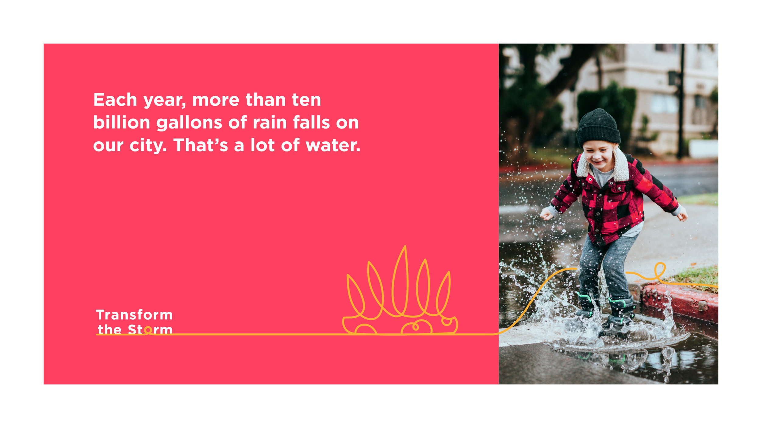
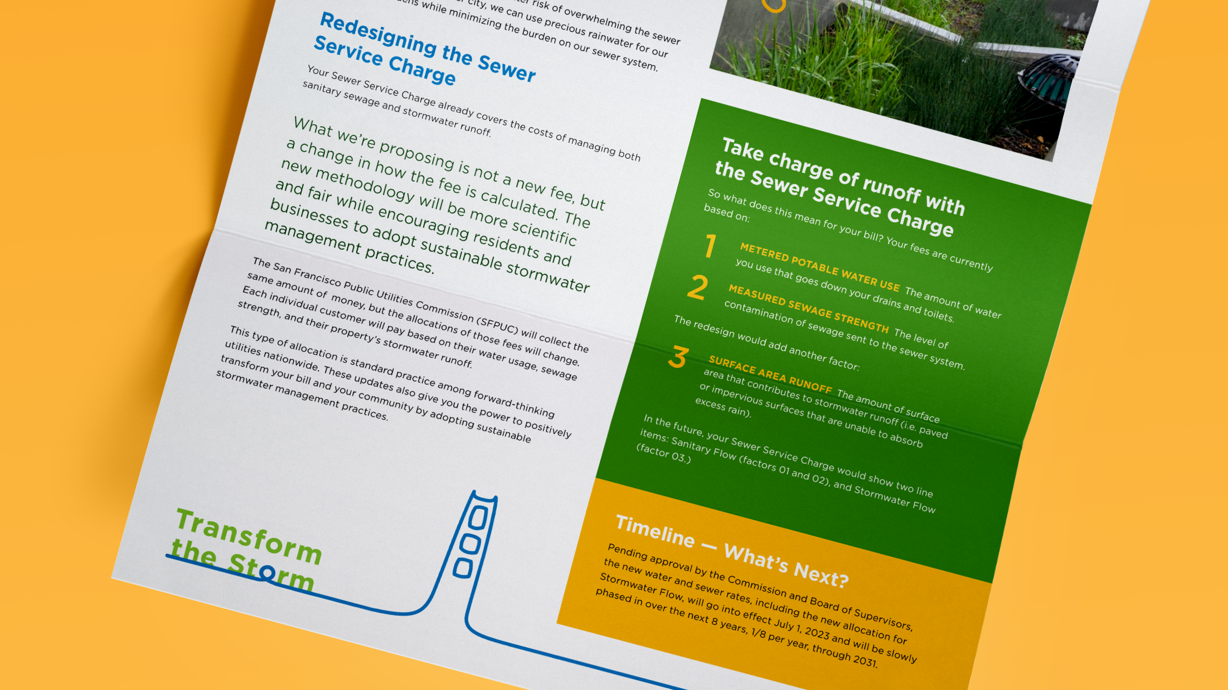
We brought elements of flowing water, neighborhood districts, and a transforming single line element to complete the full identity system. The single line graphic, inspired by the transformed letter “O” in the logo, could transform into illustrated city landmarks, playful icons or as a call-out on photography. We evolved SFPUC’s color palette to be customizable for specific audiences, in order to empower their marketing team to develop future campaigns targeting specific demographics and neighborhoods.
We delivered detailed but flexible brand standards, and included recommendations and examples for future assets like bill inserts, posters, fliers and a website. We bundled the standards with our brand platform, messaging and voice guidelines, to guide SFPUC’s design team and any new design partners to execute future assets of their own and stay on brand for many years to come.
Value
Proud to have partnered with Chef Sri from “Soup to Nuts” on this project, The Heirloom Project is now able to market, promote, facilitate and deliver not only gorgeous keepsake cookbooks, but a fun and impressively personalized experience. We’re excited to see how they grow and scale as more and more home chefs cook up something great!


Client
SFPUC — Transform the Storm
Creatives
CCO: Dava Guthmiller
Associate Creative Director: André Carnevale
Designer: Zili Ma, Meb Byrne
