Diavolicchio
Devilishly Delicious Packaging for Diavolicchio
When your client walks into the room, asks if you can make a logo look like “this,” and then proceeds to bug out his eyes, stick out his tongue and pull back his ears, you know you are in for some fun.
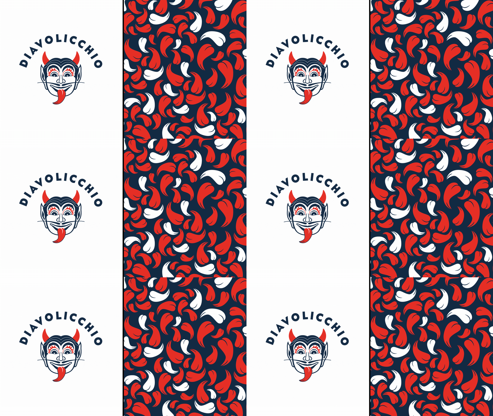
This style of olive oil, made with ground chili peppers, has a very intense, spicy flavor. Thus, the name and the devil imagery. It is commonly used in Italy as a finishing oil in place of actual chili flakes. ??We immediately noticed the similarities between the shape of a chili pepper, a devil’s tongue and a devil’s horns.
This shape became a core part of the visual system, including a lively pattern of peppers cascading down to nod at the sediment left in the oil by the peppers.
There are an endless variety of Italian olive oils in the market and most stick to a more dated, classic Italian esthetic. We wanted this brand and package design to completely buck that trend.
You can find this goodness at his little Italian merchant in North Beach, SF called Sotta Casa. Godere!
We also wanted to ensure that, at one quick glance, you knew this olive oil was going to be quite the spicy treat. We’ve affectionately named our devil logomark, Lorenzo, after our dear client who challenged us to bring his crazy facial expression to life for this delicious new brand.


Client
Diavolicchio
Creatives
CCO: Dava Guthmiller
Creative Director: Dava Guthmiller, Peter Judd
Designer: Zili Ma
