Aquaroo
A Brand System as Fun as a Beach Day
Our clients, Dan and Katy, came to us with a revolutionary prototype—a neoprene baby carrier specifically made for the water, along with a simple logo. Our primary goal was to communicate the ease and peace of mind that Aquaroo provides to families who love swimming and playing in the water.
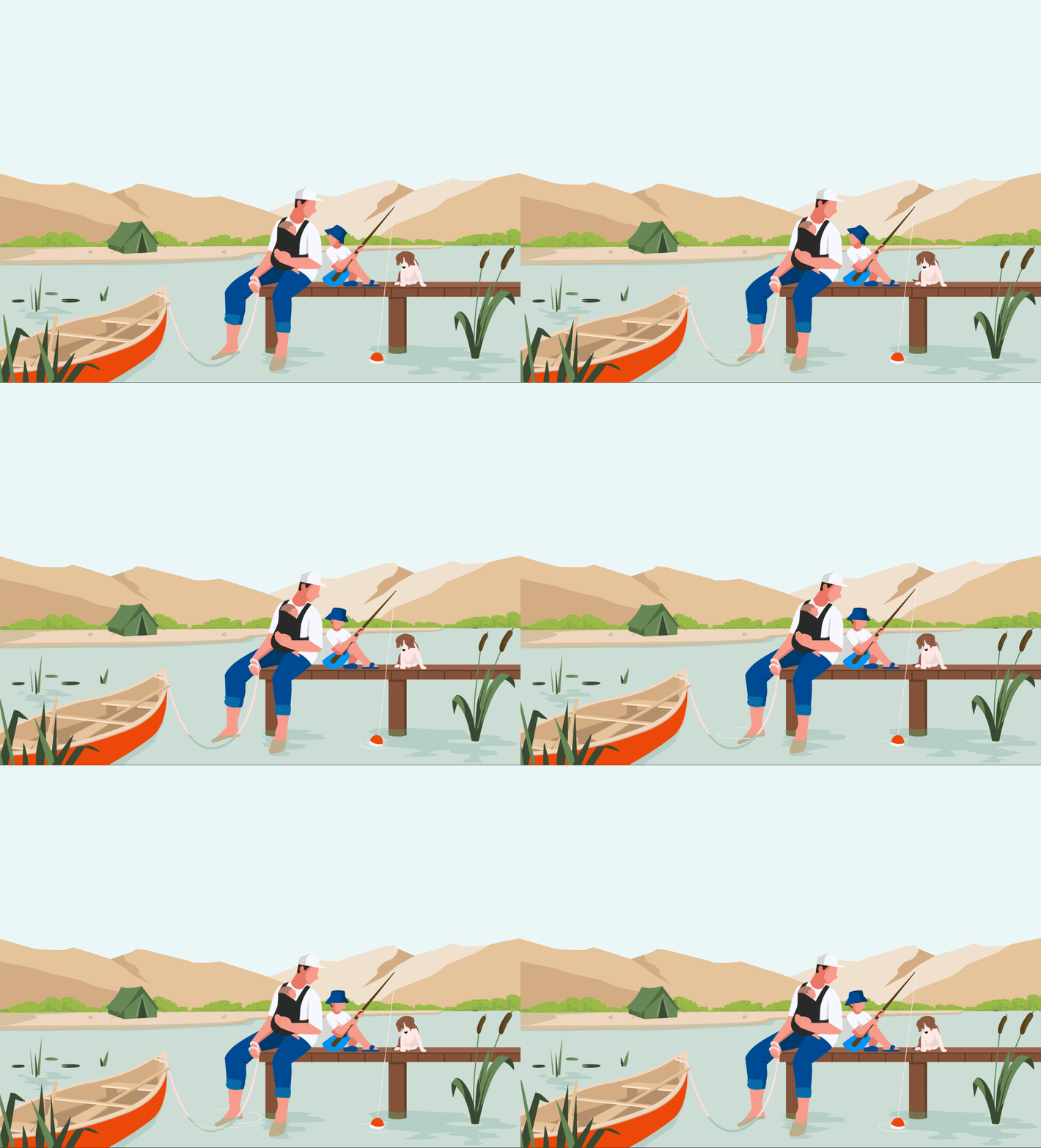
We took an unconventional approach by targeting parents instead of infants. Using playful illustrations and vibrant lifestyle photography featuring real families, we set Aquaroo apart from photo-heavy competitors. Custom illustrations were designed to permeate the entire brand, allowing potential customers to envision themselves in the joyful scenarios that Aquaroo makes possible.
THE SOLUTION
We began with a question: how can we best convey the ease and peace of mind that Aquaroo brings to water-loving families?
As one of the lead designers, I envisioned utilizing the smile beneath the Aquaroo logo as a starting point to create a set of playful brand patterns. The curve of the smile symbolizes positive energy, hearty laughter, carefree play, and contented happiness. These emotions are what Aquaroo aims to bring to every parent who loves playing in the water with their children. My goal was to create a robust graphic system that could extend to physical and various digital applications, ensuring visual consistency through deconstructed logo patterns. We developed a unique brand toolkit designed to evolve as Aquaroo continues to address family swim-time challenges.
We established the brand's tone around the core idea of "carefree enjoyment of water." This concept emphasizes the safety, practicality, and fun functionality of Aquaroo’s baby carriers, highlighting the enjoyable experience of using Aquaroo products.
Collaborating with Dan and Katy, we crafted an adventurous brand story, steering clear of the often-seen childish brands in the current market. We emphasized childhood adventure, bravery, and freedom, showcasing how water fun can be easy and relaxed.
THE RESULTS
Aquaroo's visual identity quickly gained recognition among consumers. Our design not only emphasizes the safety and fun of the Aquaroo baby carrier but also highlights the peace of mind it provides to parents and the joy it brings to children. The brand encapsulates the carefree, adventurous spirit of childhood, showcasing the playful innocence of kids.
Distinct from the typical childish and immature styles prevalent in the market, we opted for a more mature and refined aesthetic. This unique design approach has allowed Aquaroo to stand out in a crowded market, earning the trust and affection of families.


Client
Aquaroo
Creatives
CCO: Dava Guthmiller
Creative Director: Peter Judd
Designer: Zili Ma
Illustrator: Alexa Pleiko-Izik
Photography & Video: Gammanine
Video ACD: André Carnevale
